A wall panel as simple as a light switch.
A touchscreen in the wall of almost every room in Veev's prefabricated homes. An agency designed the first version around gestures. I redesigned it around simple, visible controls, together with the mobile app.
- Role
- UX/UI Designer
- Company
- Veev
- Timeline
- 2020–2022
- Platform
- Android wall panel
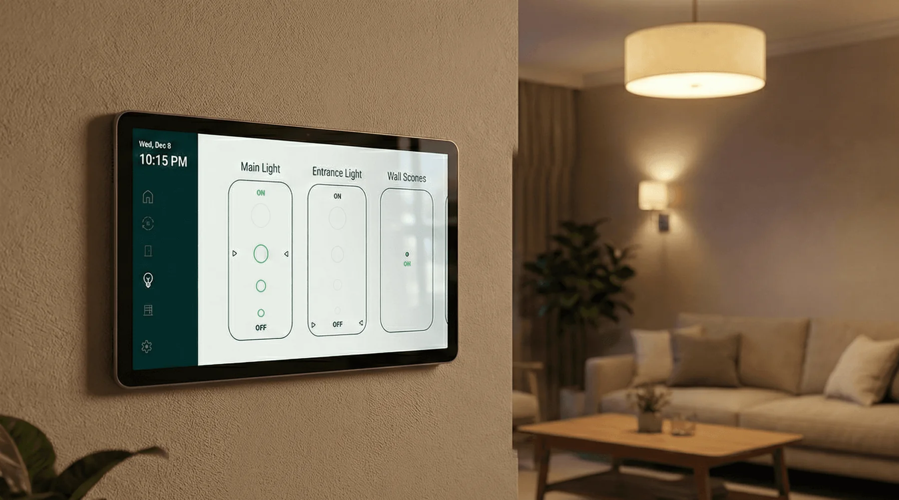
The first panel, designed by an agency, was hard to navigate and relied on complex gestures. Veev also needed it to support new devices.
Replaced the hidden gestures with controls you can see, moved navigation into a fixed rail, and designed it together with the new app.
A panel that works like a switch. Lights, shades, the front door and modes are one tap away, in the same design language as the app.
Hard to use, with more devices on the way.
An agency designed the first panel. It was hard to navigate and relied on complex gestures. At the same time, Veev was adding new devices and technologies.
No time to learn.
The panel sits on the wall of almost every room, hallways included. Homeowners use it, and so do guests, children and residents who are not technical. Nobody gets onboarding. The benchmark was the physical light switch.
Every home is different.
Each home had its own mix of rooms and devices, and the panel had to handle all of them. Veev sold premium homes, so it also had to be visually quiet and fit any interior.
Start from what is in each room.
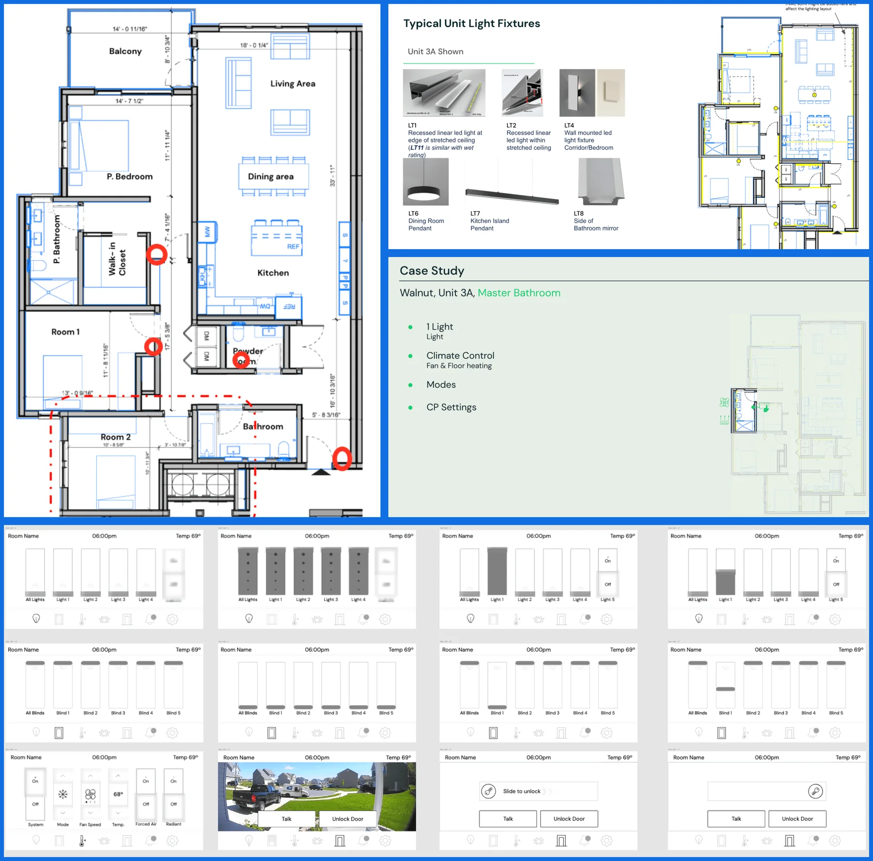
I began with the floor plans and the devices of each unit. Then I wireframed a new direction for each device type.
Room by room.
For each unit I went through the floor plan, the light fixtures and the devices in every room. A room breakdown shows what its panel has to control.
- Example
- Walnut, unit 3A, Master Bathroom.
- Controls
- One light, climate with a fan and floor heating, modes and panel settings.
Dark, light and in between.
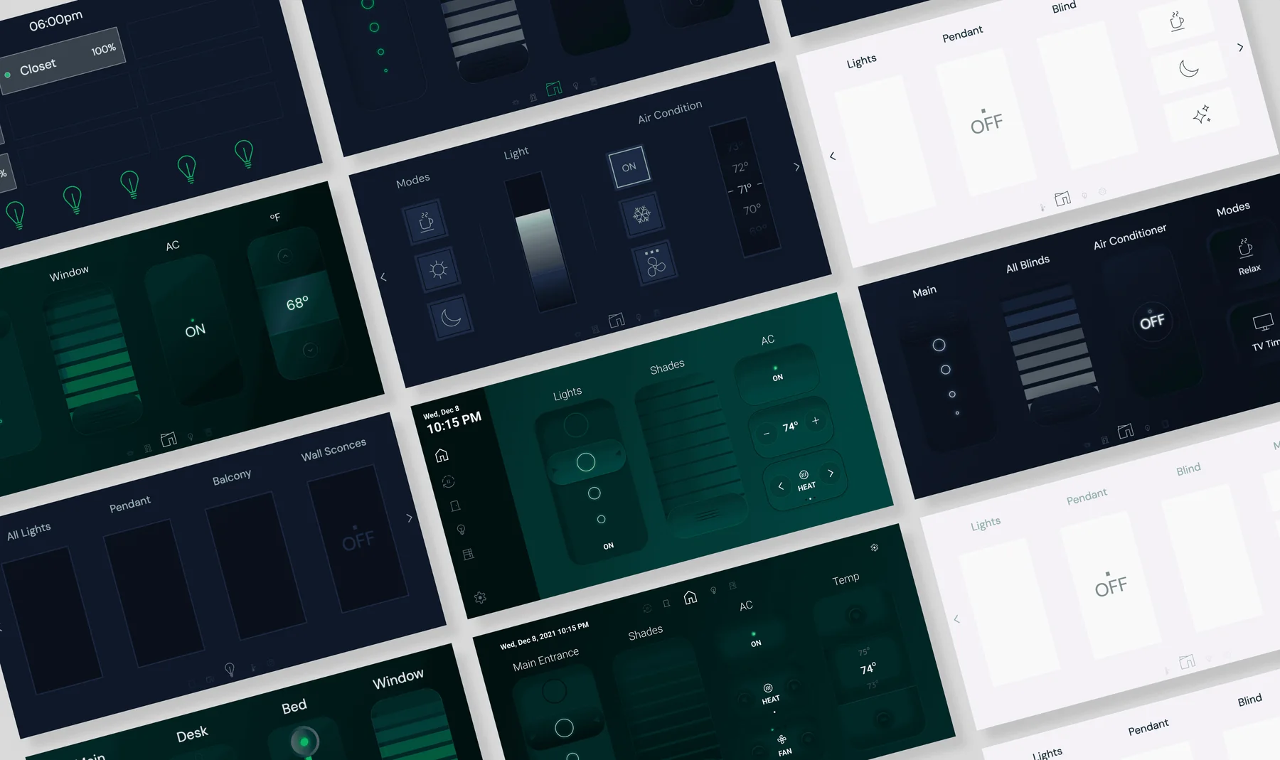
I explored dark and light directions, and different layouts for lights, shades, climate and modes. The final design uses a dark rail for navigation and a light canvas for the controls.
Visible controls instead of hidden gestures.
The agency's spec relied on long presses, drags and an edge swipe. Nothing on screen showed them. I replaced them with controls you can see.
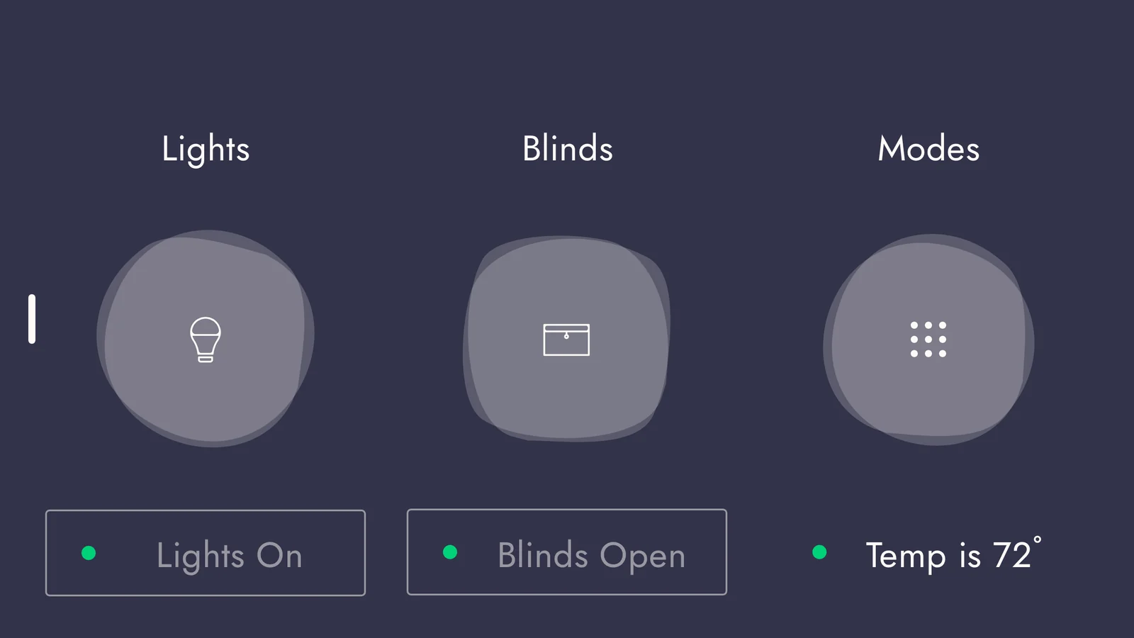
1Touch and hold the Lights button.
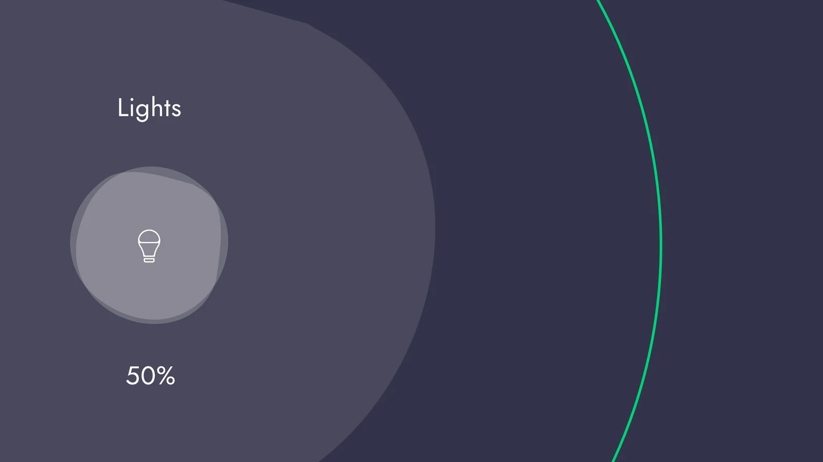
2Slide on the full-screen take-over. The direction depended on where the button sat on the screen.
For a button on the right, you slid left and up. For a button on the left, the other way. A tap on the same button did something else and opened a screen with each light on its own.
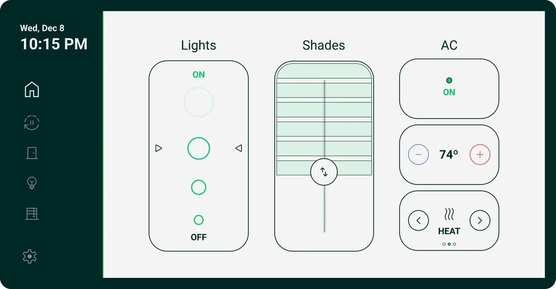
1Slide along the light.
The control is always on screen, in the same place, and it moves the same way the light level does.
V1 screens are rendered from the agency's design file. The gestures are described in that file's own notes.
The babysitter test.
Be a guest in a Veev home. Do the same two tasks on the agency's panel and on my redesign, and compare.
- Dim the living room lights low. Leave a little light on.
- Check that the front door is locked.
You are babysitting in a Veev home.
The kids just fell asleep. You have never used this wall panel before. Do two things:
- Dim the living room lights low. Leave a little light on.
- Check that the front door is locked.
Round 1 is the agency's original panel. Round 2 is my redesign. Both rounds are timed. If you get stuck, the panel shows you where to press.
Old panel: 0.0 sec.
This is the problem I was asked to solve. The controls were there, but hidden behind long presses and swipes.
Now do the same two tasks on my redesign.
Same tasks.
Same home, same tasks. The redesign puts every control on screen, so a guest can use it without help. That is the core of this project.
How the old panel works here: tapping a button opens each light on its own, dimming needs a long press and a slide whose direction depends on where the button sits, and the menu hides behind a drag from the left edge. This follows the agency's own design notes, simplified for the browser.
Controls that work like switches.
Large, simple controls on a light canvas. Dimmable lights get a control you slide, with dots as anchors for the level. On/off lights get a simple switch.
Lights 61% · Shade 57% closed · AC on, 74°, heat
Every device type one tap away.
The rail on the left holds Home, Modes, Door, Lights, Shades and Settings. The date and time stay on top of every screen.
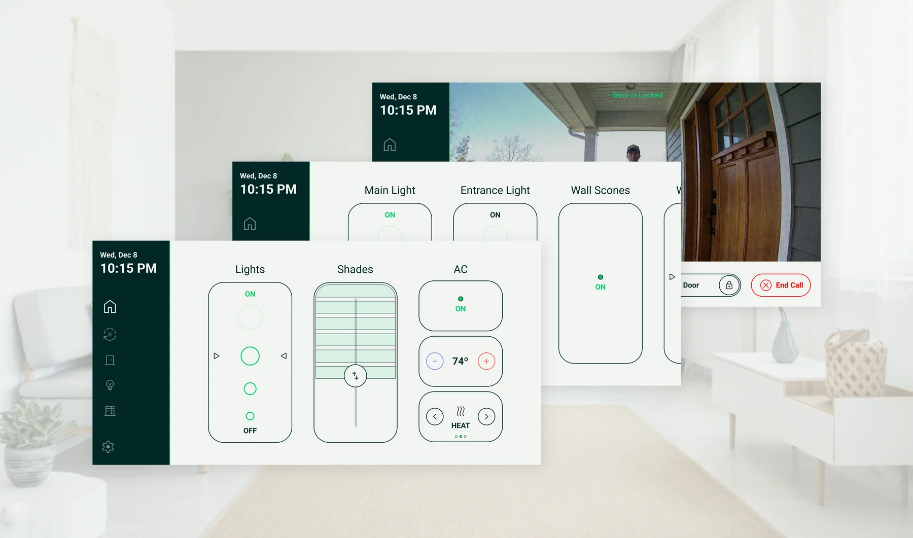
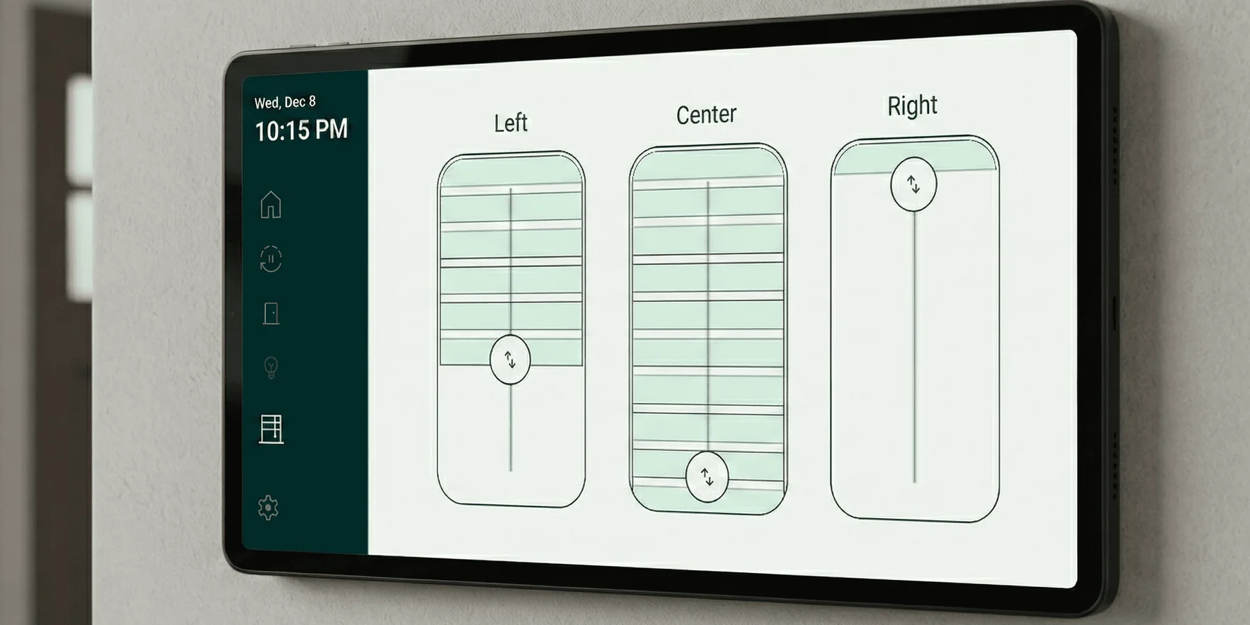
One control per window.
Each shade has its own control. Drag the handle to set its height.
Answer the door from any room.
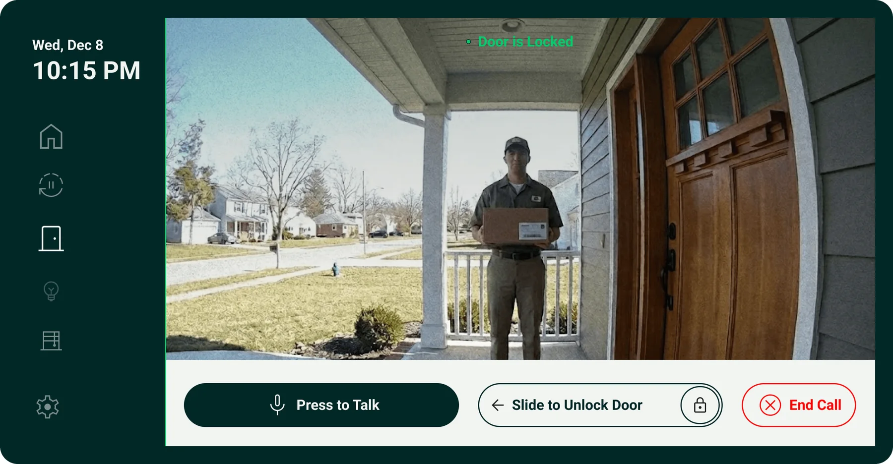
The doorbell camera opens on the panel. Press to talk, and slide to unlock the door.
Designed with the app.
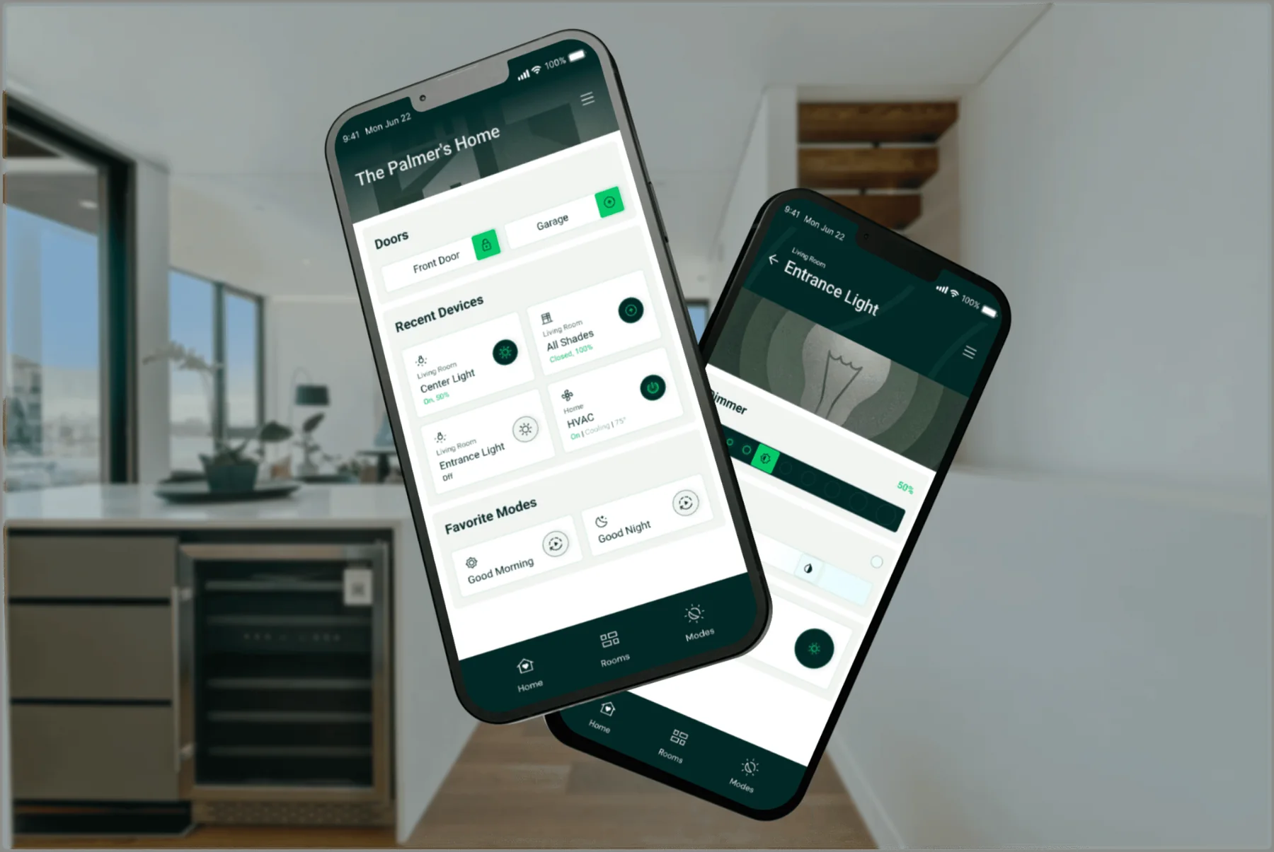
I redesigned the panel at the same time as the mobile app. Both use the same colors and controls, so a device looks and works the same on the wall and on the phone.
What I learned.
- 01
Speed builds trust.
The benchmark is the light switch. If a tap does not respond at once, people stop trusting the panel.
- 02
Visible beats clever.
Guests and children use the panel with no onboarding. A control they cannot see is a control they will not find.
- 03
The screen is part of the interior.
A panel in every room should be quiet. It has to fit the room, not stand out like a gadget.
Let's talk.
I'm looking for a senior product design role on a team that builds complex products. B2B platforms, operations tools and client experiences.