From floor-plan maps to a simple room list.
A full redesign (V2) of the app for Veev's prefabricated smart homes. An agency built V1 around floor-plan maps. I replaced them with a room list and simpler device controls.
- Role
- UX/UI Designer
- Company
- Veev
- Timeline
- 2020–2022
- Platform
- iOS and Android
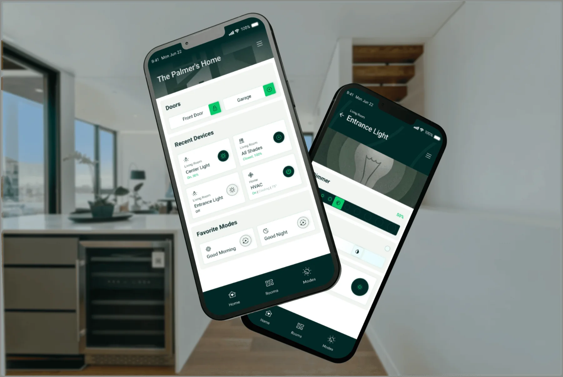
V1 was built around floor-plan maps. Users found them confusing, and every new project meant drawing new maps by hand.
Made the room list the only structure, put the most used devices on the home screen, and redesigned the device controls.
Turning off a room light went from 6 taps to 3. Each new project saved 2 to 4 days of map design, before fixes and QA.
The maps confused users and could not scale.
Homeowners controlled lights, shades, climate and doors from the app and from the wall panels, which I also designed. In V1, every device sat on a floor plan.
Hard to find the right device.
User interviews, and feedback from marketing and customer support, showed the same thing. People struggled to find a device by its place on a map. It was worst for new and occasional users, like a cleaner, a babysitter or grandparents.
Every project needed new maps.
Veev ran dozens of projects, each with several unit models. For every one, I drew the maps as SVG files, with exact names for every wall, door, window and room. That took 2 to 4 days per project. Then developers connected the maps, and each one went through rounds of fixes and QA. At the scale Veev planned, the maps alone would have needed their own team.
A list of rooms instead of a map.
V1 already had a list view inside each room. We made the list the only structure and removed the maps. Then we compared both on one everyday task: turning off the main bedroom light.
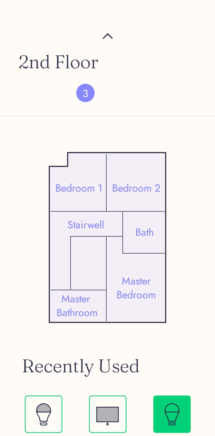
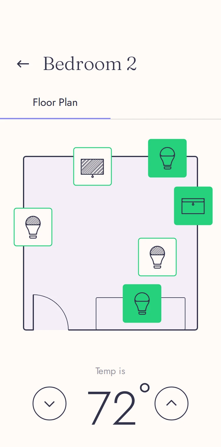
Swipe to the right floor, find the room on the plan, then find the light inside it.
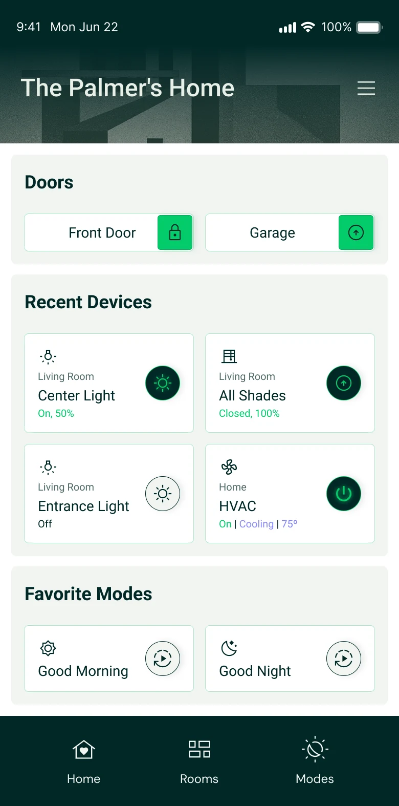
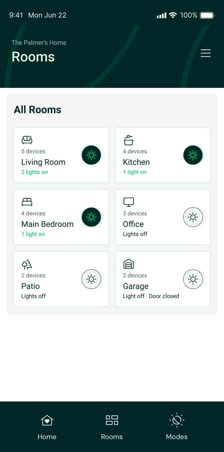
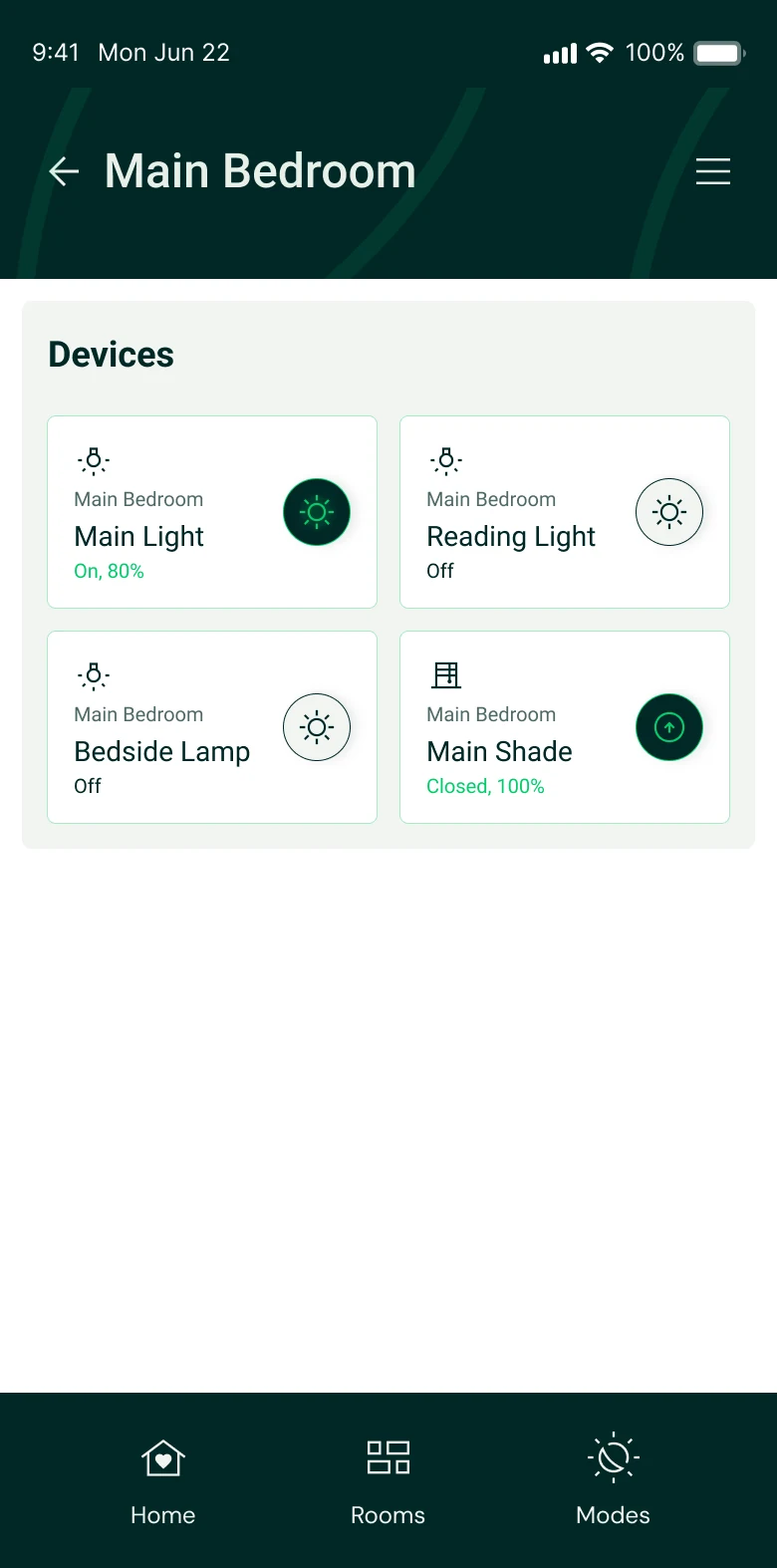
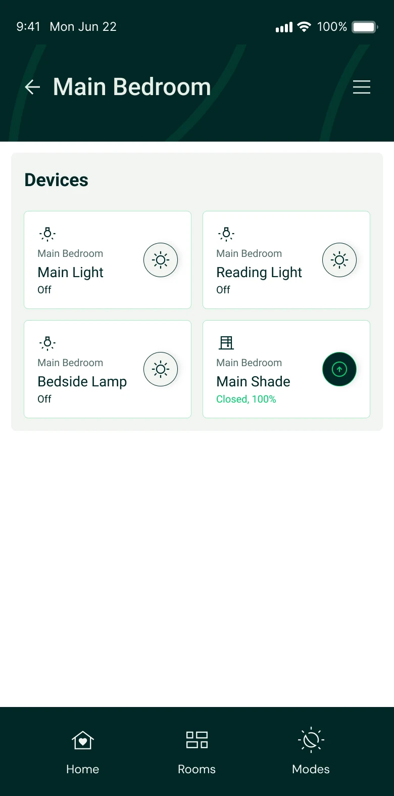
Try it. Tap Rooms in the tab bar.
V1 screens are rendered from the original design file. The V2 Rooms and Main Bedroom screens were rebuilt in Figma from the V2 design system.
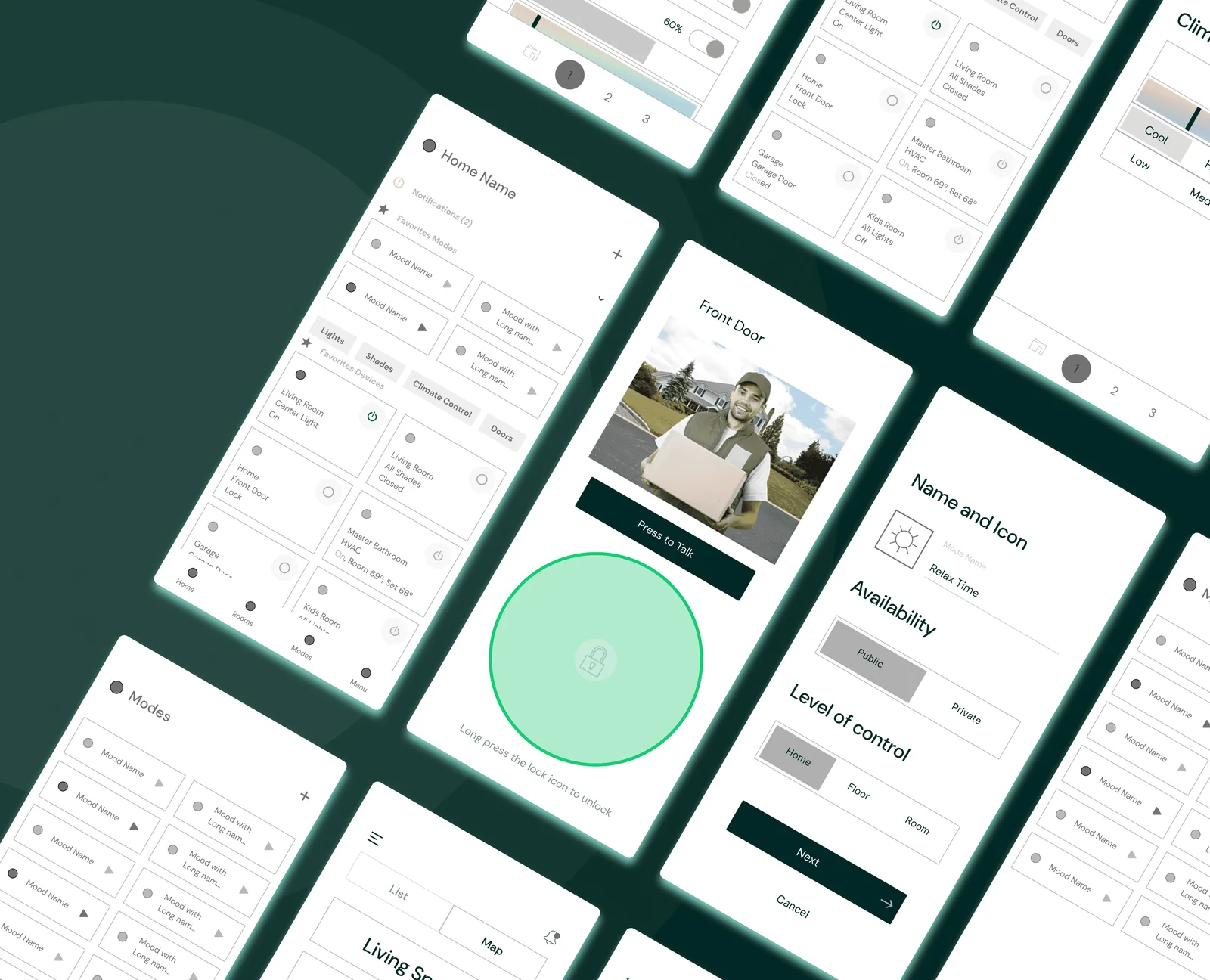
Wireframes first.
The home screen, device controls and modes were explored as wireframes before the visual design.
Frequent devices first, then clear controls.
The home screen shows doors, recent devices and favorite modes. Everything else is in Rooms.
Built for touch.
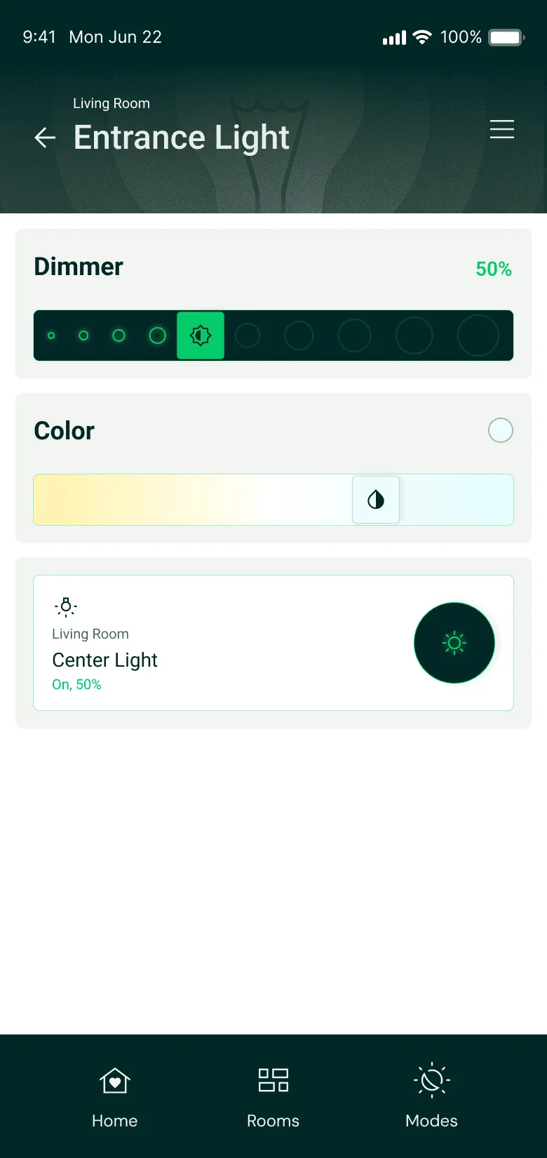
Simpler sliders, larger touch targets and direct toggles.
- Lights
- Dimmer and color on one screen.
- Shades
- Position, plus presets like Daylight and Privacy.
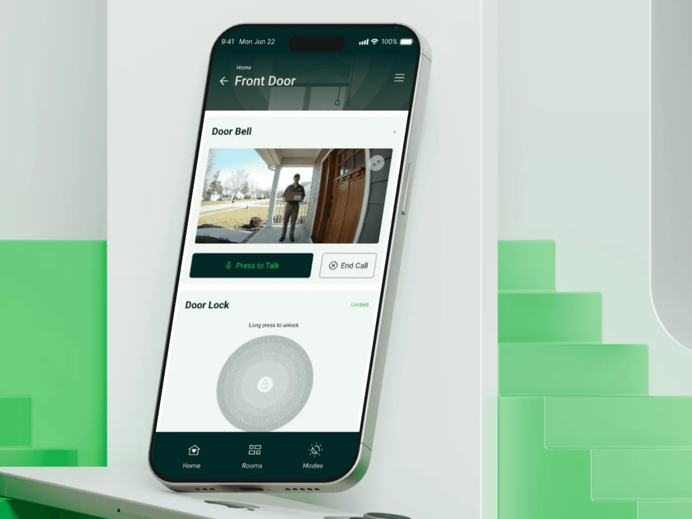
Doorbell and lock on one screen.
See who is at the door, talk to them, and unlock with a long press.
Simpler to use and simpler to ship.
6 → 3 taps
To turn off the main light in a room. Favorites on the home screen cut steps for the most used devices.
Easier controls
Bigger touch targets and simpler sliders made the app more accessible.
2–4 days saved
Per new project, in map design alone. The development, fixes and QA rounds that followed were saved too.
What I learned.
- 01
Function over novelty.
The maps impressed in demos. In daily use, a plain list worked better.
- 02
Design for the least experienced user.
A guest or a babysitter has no time to learn a floor plan. If they can use it, everyone can.
- 03
Good design has to scale.
A pattern that needs manual work for every new project will break as the company grows.
Let's talk.
I'm looking for a senior product design role on a team that builds complex products. B2B platforms, operations tools and client experiences.