


Smart Home App case study
Show one decision, clearly.
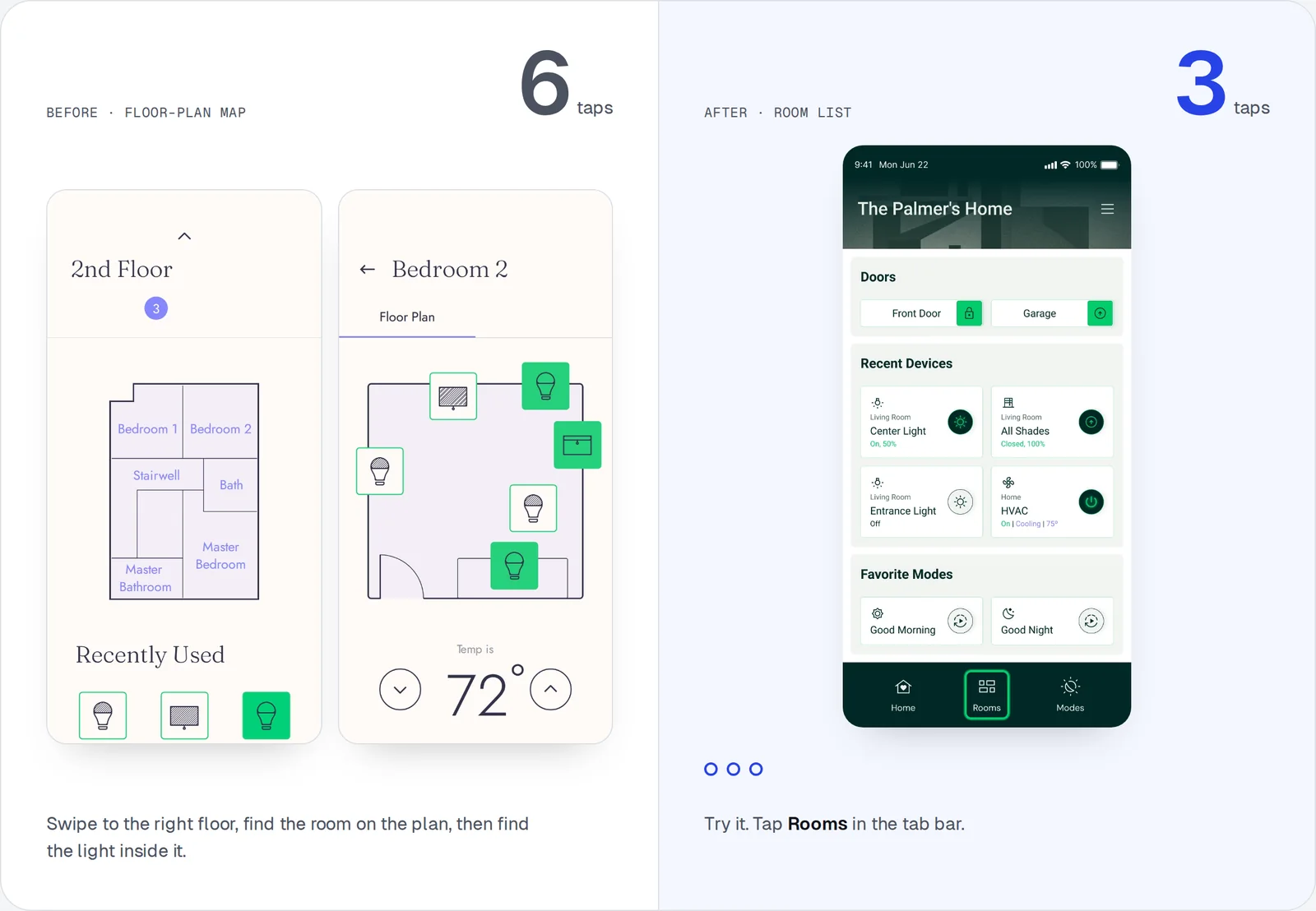
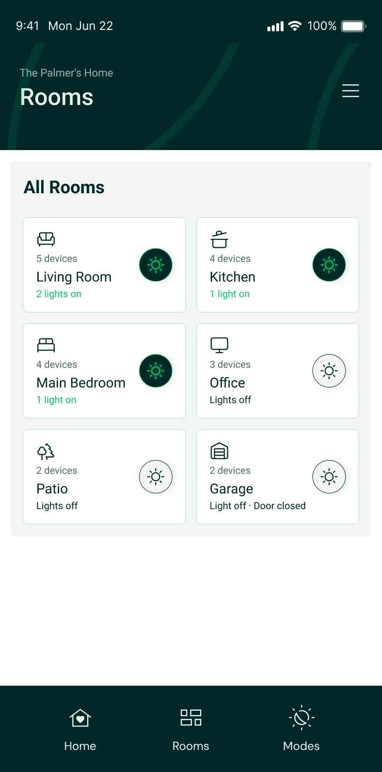
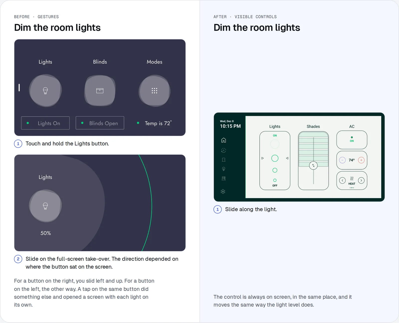
The case study is about one change, a list of rooms instead of floor-plan maps. The section that explains it took three versions to make that clear.
See it in the case studyWhy it went back
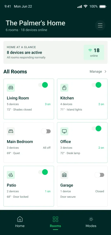
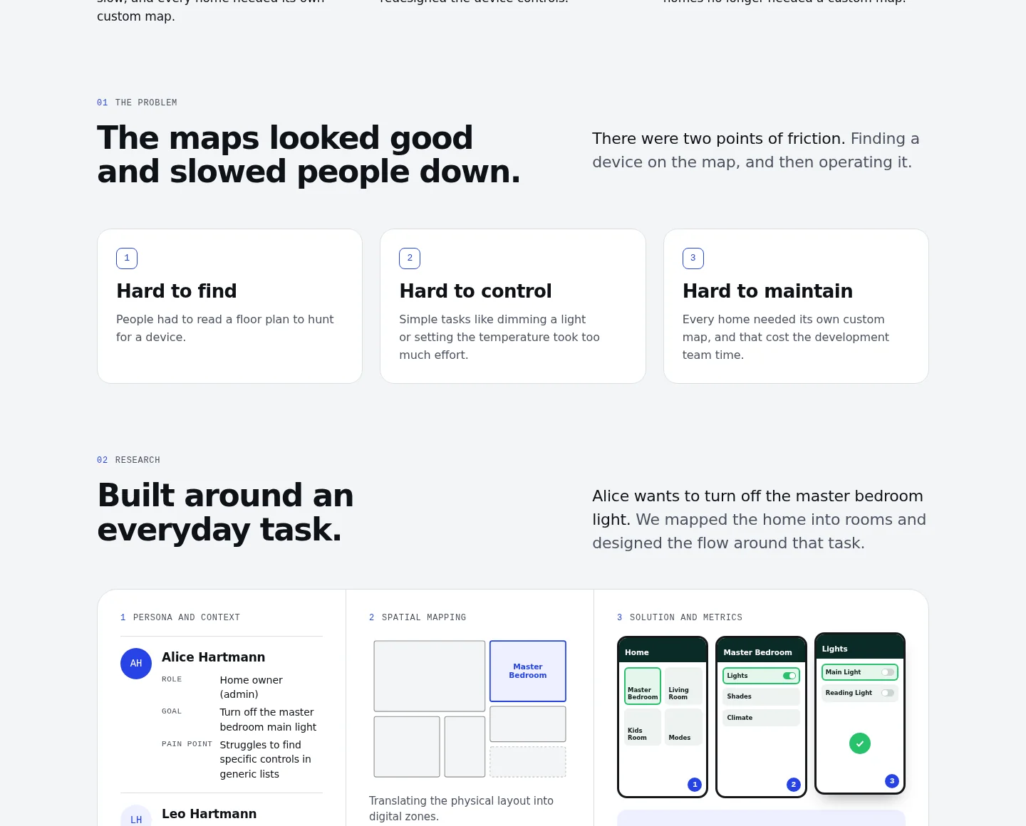
It tried to show everything at once. The one decision that mattered was lost, and the reader had nothing to hold on to.
Why it went back
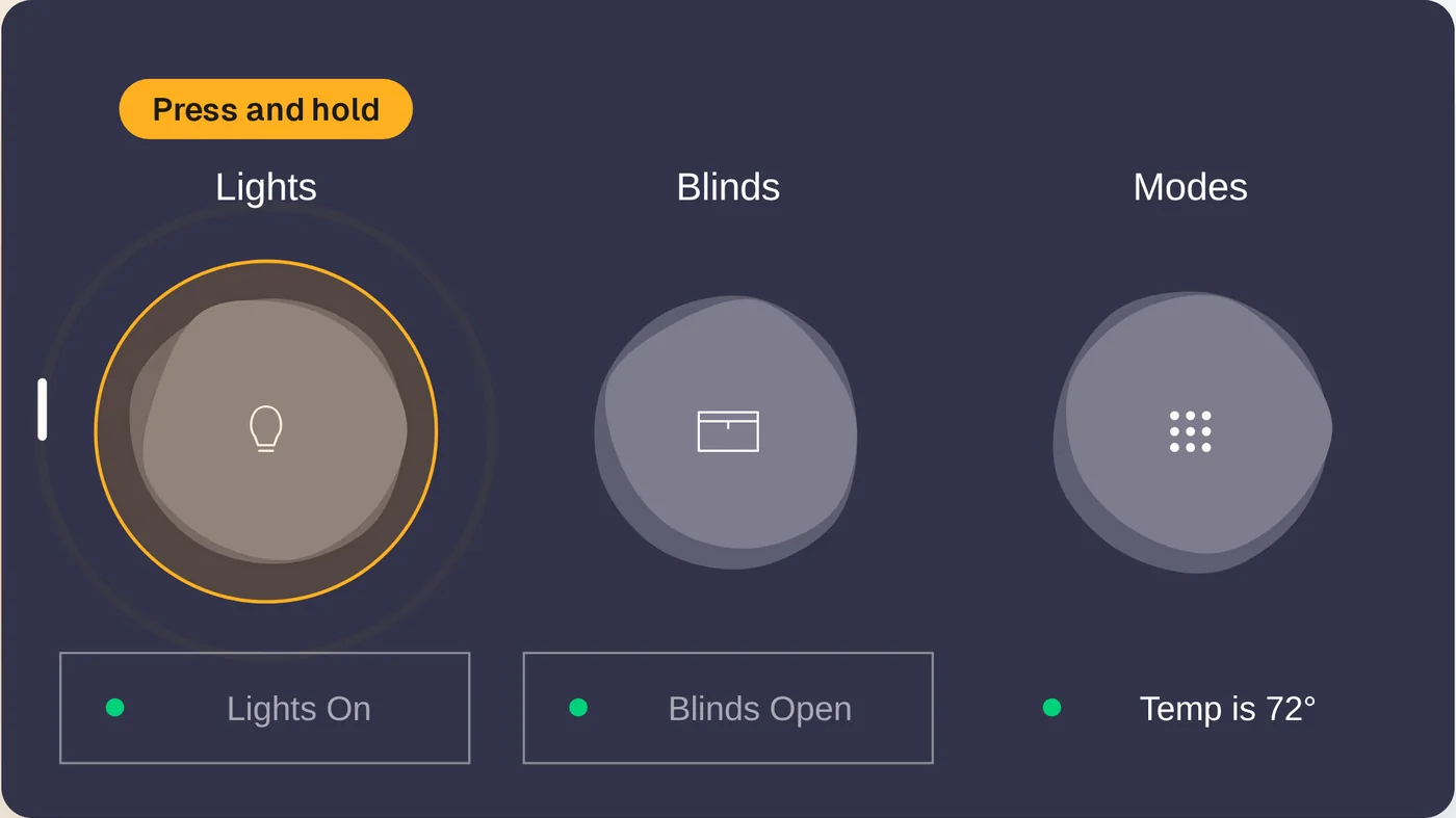
The comparison was clear, but the old app used real screens and the new one a drawn model. The redesign looked weaker than what it replaced.
Why it works
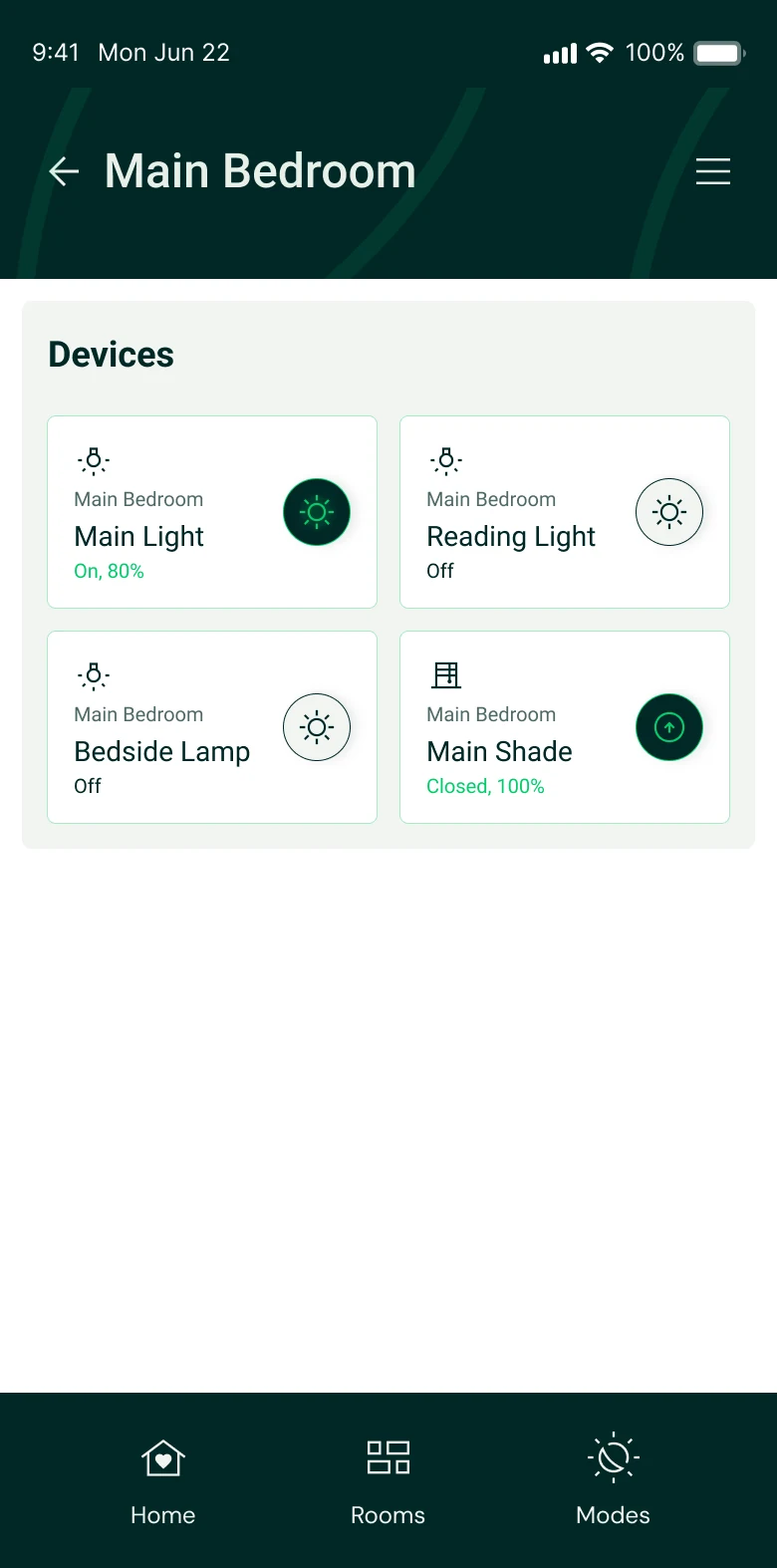
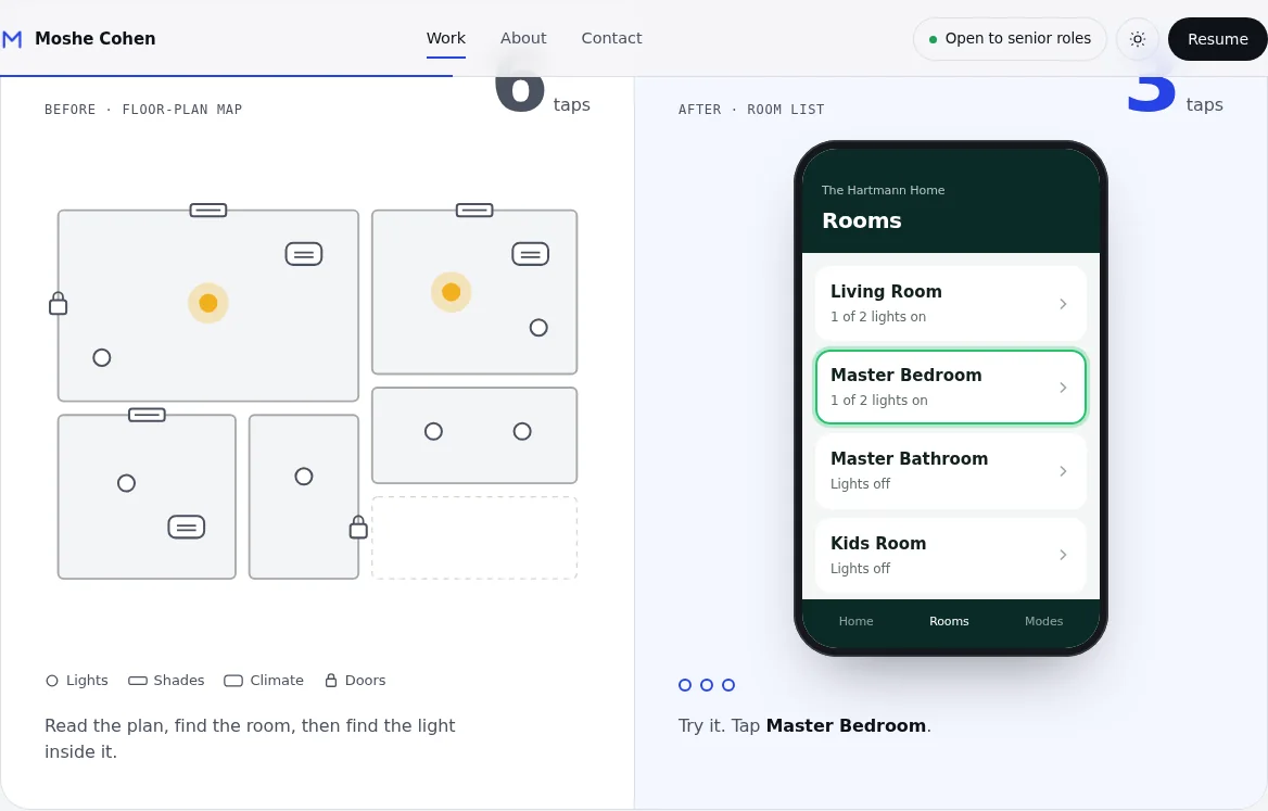
Both apps use real screens at the same size, and the reader taps through the new one. They feel 6 taps against 3, not just read it.