Case studyDesign with AI2026

How I rebuilt this portfolio with AI.

I directed the design and made every decision. AI wrote the code, prepared the images and ran the checks. This page shows the decisions behind the site, including the versions I sent back.

Role
Design lead
Tools
Figma, AI
Scope
7 pages, 4 case studies
Status
Live. You are on it.
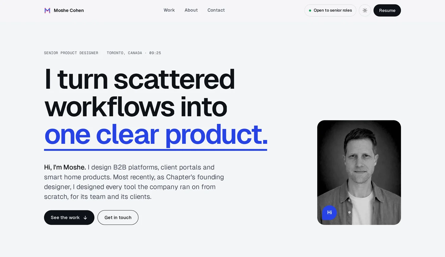
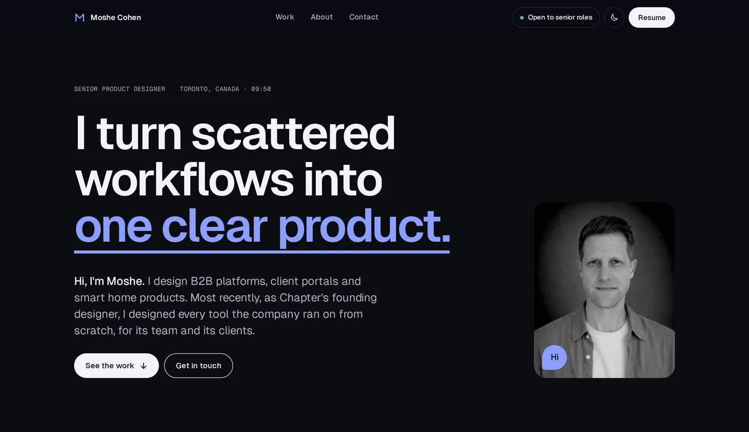
The new home page: a clear headline, a short intro, the portrait and two buttons
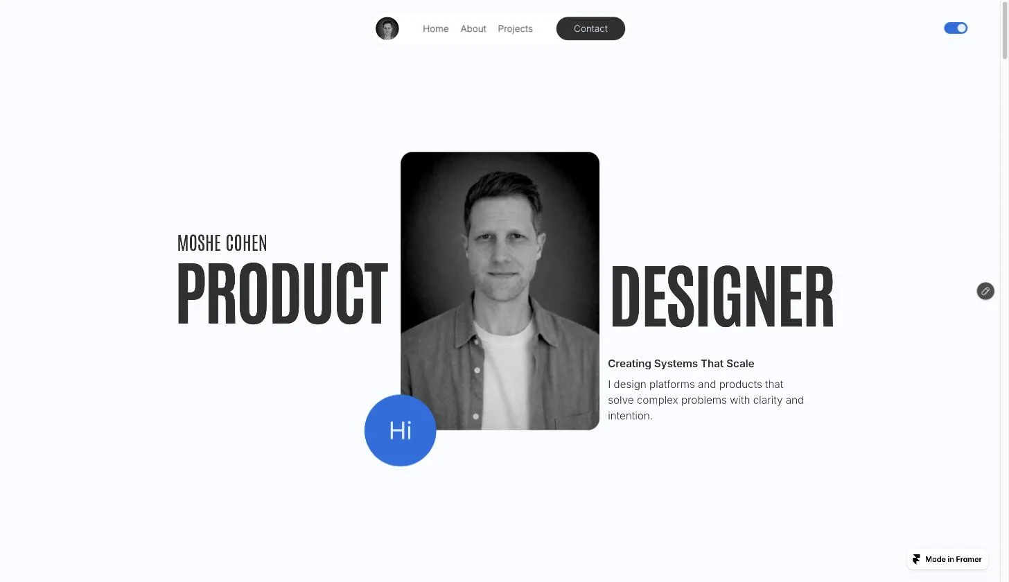
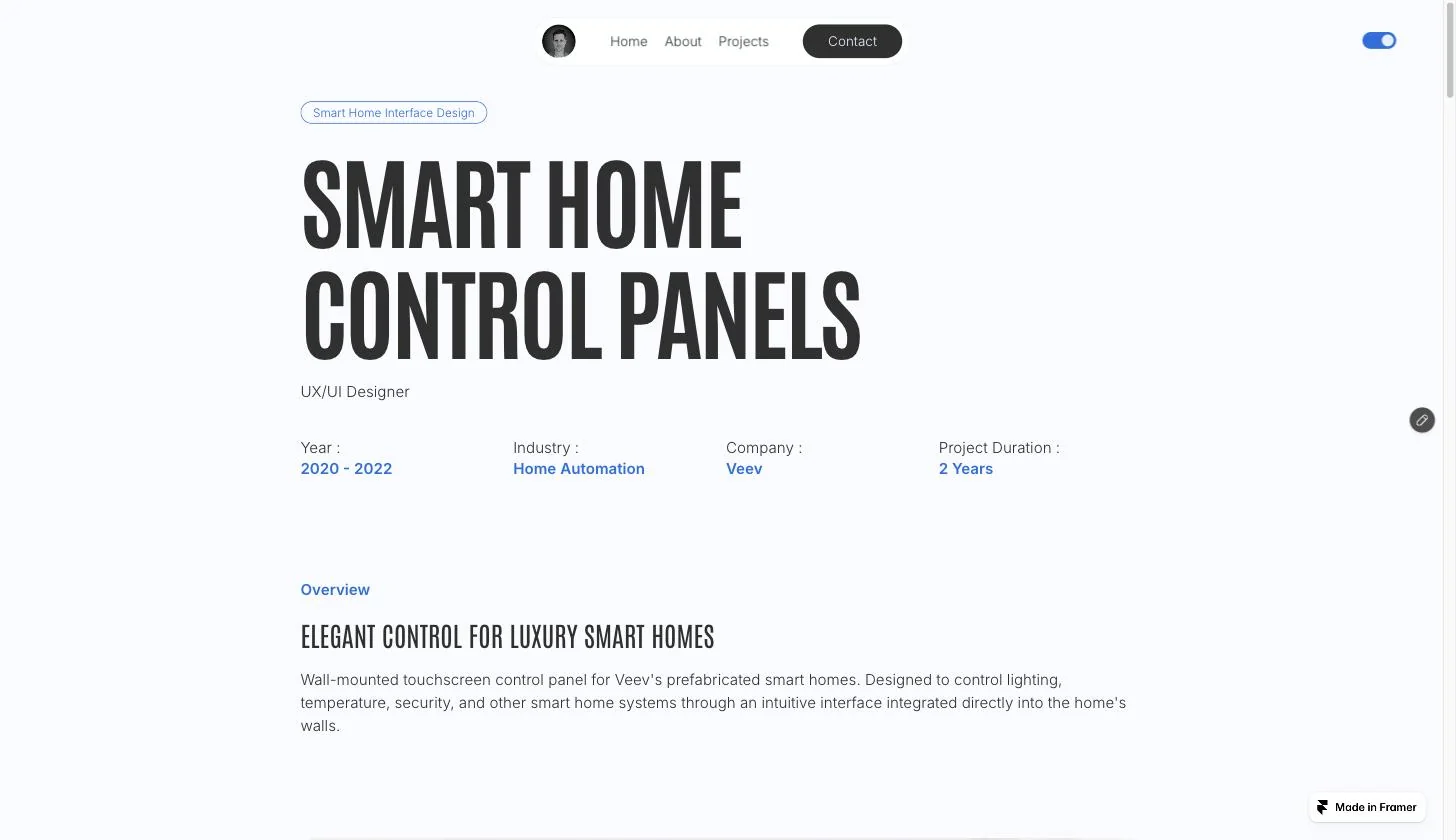
The old home page on Framer: large condensed display type around the portrait and a one-line tagline
Before · Framer After · this site
DragThe old home page and the new one, at the same size.
01The starting point

Polished, but it did not tell the story.

My old Framer site had big type and good images. But the case studies listed features, so a reader could not see the problem or the decision.

Old case study page: a large condensed title, a role line and four facts
BeforeA big title, then features.
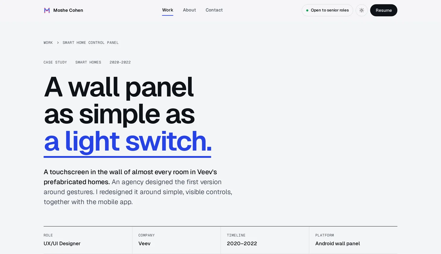
New case study page: a headline that states the idea, a short lead, facts and a cover image
AfterThe headline states the idea. The lead says what I did.
02How we worked

I set the direction. AI did the building.

I worked like a design lead with a very fast team. I gave direction, reviewed every result and sent back what was not right.

1

The facts come from me

AI drafted the copy only from what I told it. When it guessed, my correction became a rule for every page.

2

Notes on the live page

I reviewed the published site like a visitor and commented on the exact element to change.

3

Less, then less again

AI tends to add. Most of my notes asked it to remove things until one idea was left.

03The concept

The site shows how it is built.

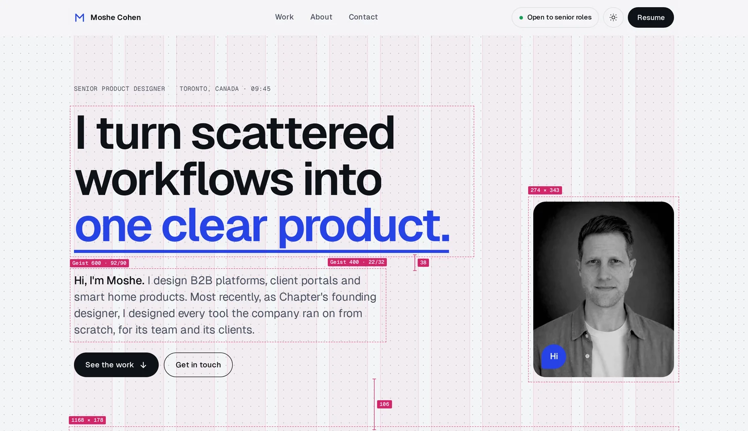
Under every page sits a second layer. It shows the grid, the columns and the size of each element, so you can see that every detail was chosen.

The home page with its design layer showing: a dot grid, twelve columns, dashed element bounds and type specs
The home page as visitors see it
The page The layer underneath
DragThe home page, and the layer under it. On the live site it only shows near the cursor.
The design layer

A flashlight on the design file.

Move the mouse over any page to see the grid, columns and element sizes near the cursor. On phones, it appears in a band as you scroll.

The logo

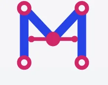
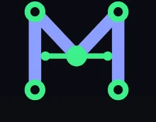
An M drawn as one vector path.

Hover over the logo at the top left to see its anchor points and handles, like a selected path in a design app.

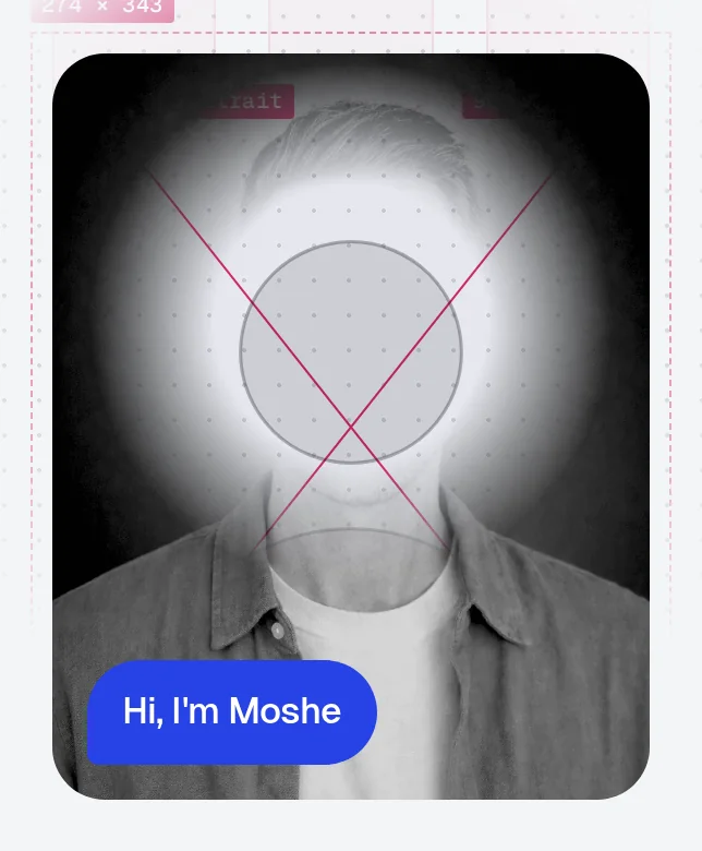
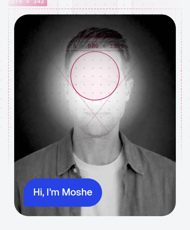
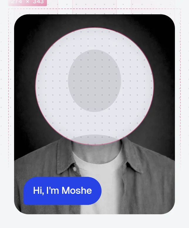
The portrait with the lens showing an empty image placeholder The portrait

An empty frame behind the photo.

On the home and About pages, a small lens over my photo shows an empty image placeholder, like in a design file.

04The decisions

Each detail took a few rounds.

Each block is one part of this site. Where there are versions, you can see what I sent back and why.

Smart Home App case study

Show one decision, clearly.

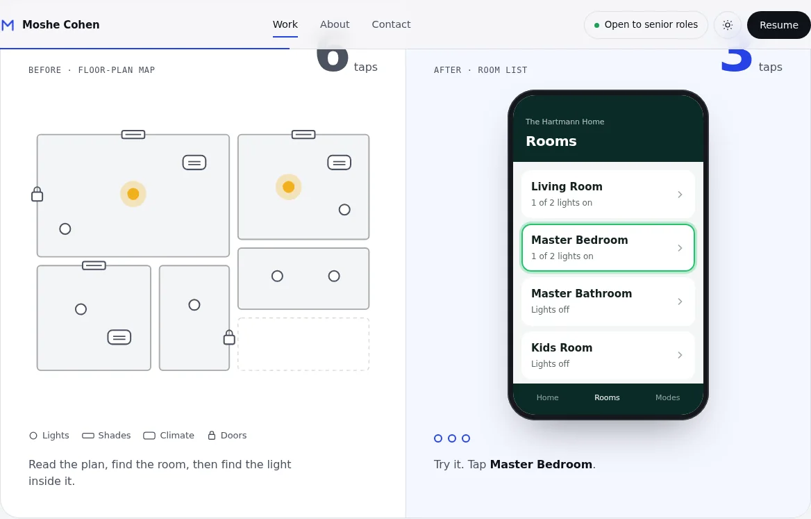
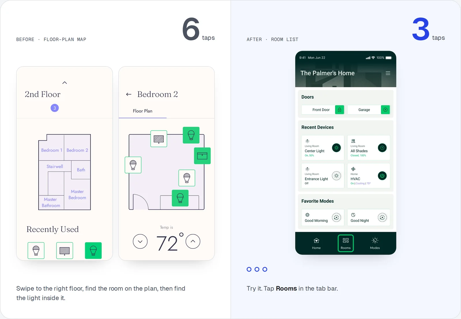
The case study is about one change, a list of rooms instead of floor-plan maps. The section that explains it took three versions to make that clear.

See it in the case study
Why it went back

It tried to show everything at once. The one decision that mattered was lost, and the reader had nothing to hold on to.
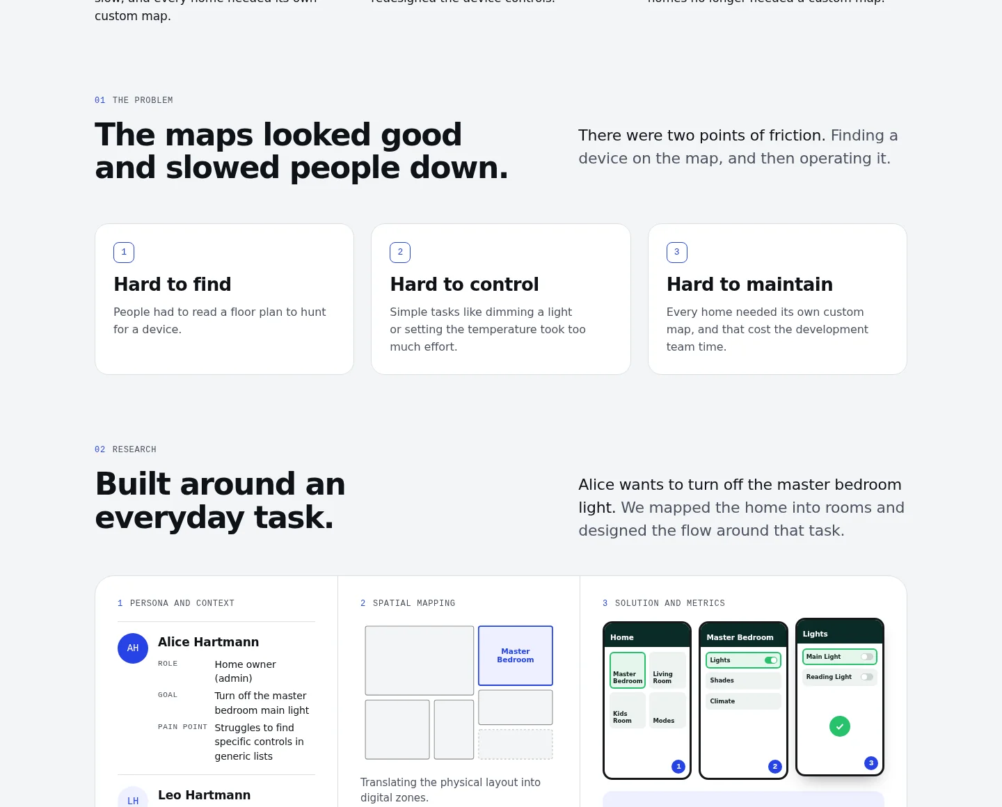
First version: three problem cards, two personas, a mapping board and a flow, all in one section
Smart Home App case study · Figma

Build missing screens in the app's real design system.

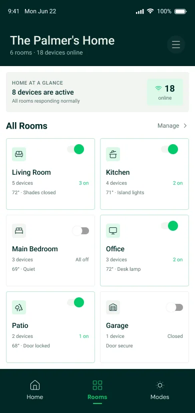
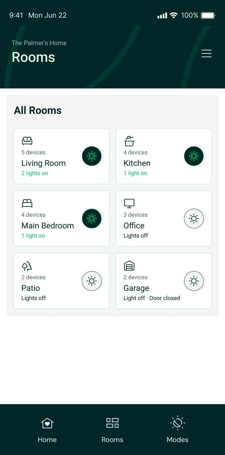
Some screens I needed no longer existed. I recreated the room list in Figma, AI aligned it to the app's real components, then built the next screens. My own frame stayed untouched.

Fixed
One kind of light button instead of two, one status line per room, no repeated summary card.
Added
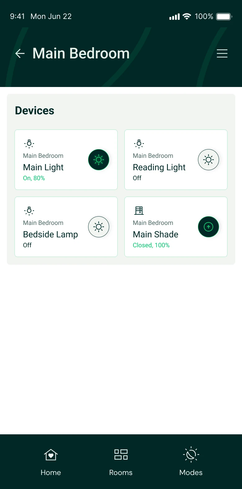
The bedroom screen, with the light on and then off, so visitors can tap through the whole task.
My recreation of the Rooms screen in Figma, with toggle switches and a summary card
My recreation
Fixed Rooms screen with round light buttons in the V2 style
Fixed
New Main Bedroom screen with the main light on
New
Smart Home Control Panel case study

Find the story in the original files.

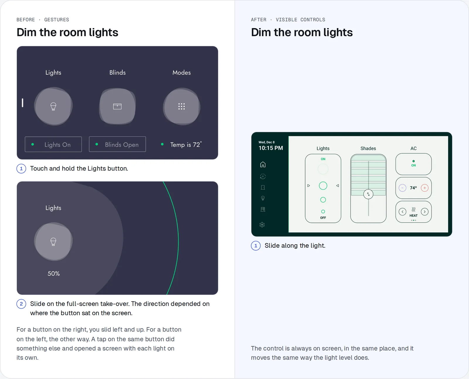
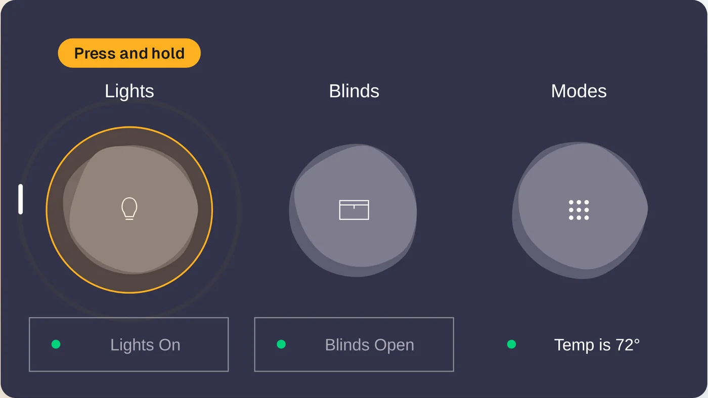
The panel is a wall touchscreen in almost every Veev room. The agency's first version hid its controls behind gestures, and their design file described each one in notes. Those notes became the center of the case study. I corrected two details from my own experience.

See it in the case study
The panel comparison: the agency's gesture flow on the left, the new visible control on the right
Smart Home Control Panel case study · Mini game

Let visitors feel the problem.

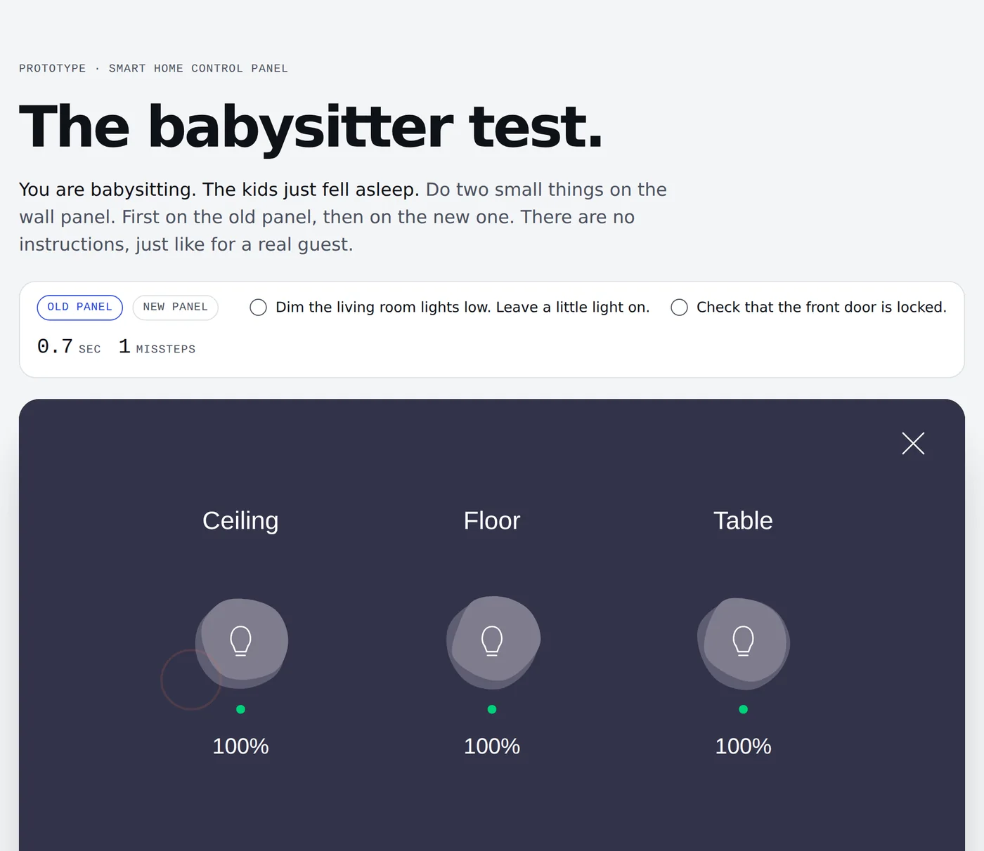
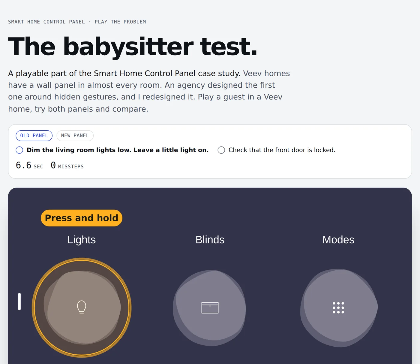
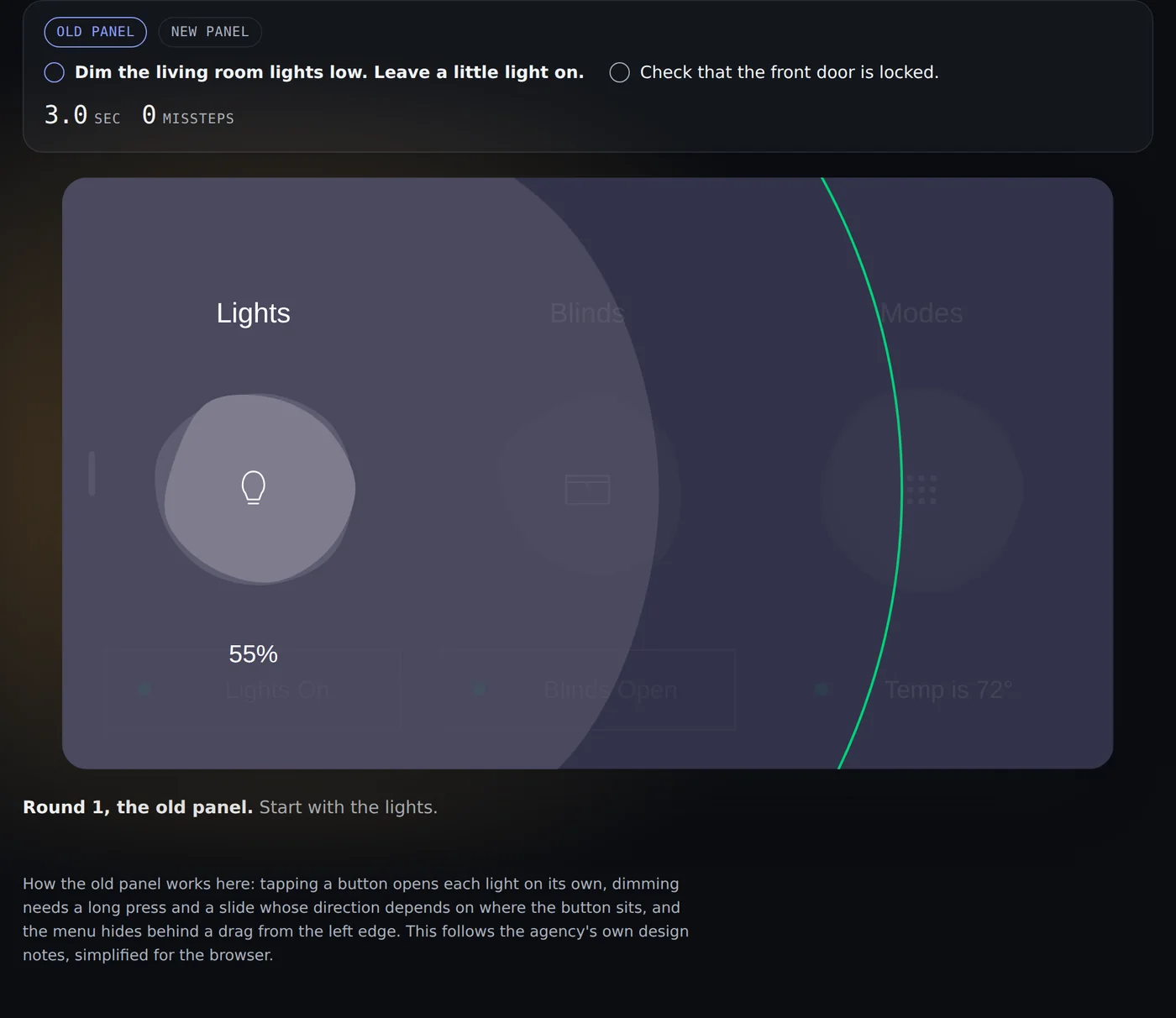
A comparison is easy to skim past. So visitors play a babysitter who must dim the lights and check the door, first on the agency's panel and then on mine. It took four rounds.

Play it in the case study
Why it went back

On a phone the panel was too small, and a recruiter may well open it there. New visitors also did not know why they were playing, and text hints under the panel were easy to miss.

First game version: the old panel with no guidance, after a wrong tap
Every page · Light and dark mode

Small moments still get two options.

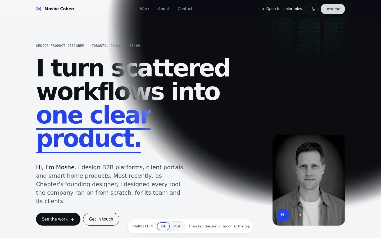
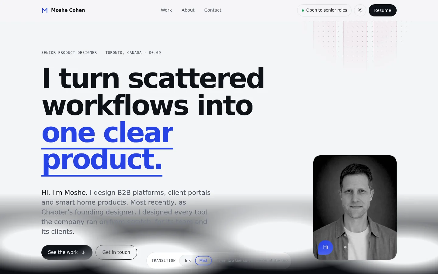
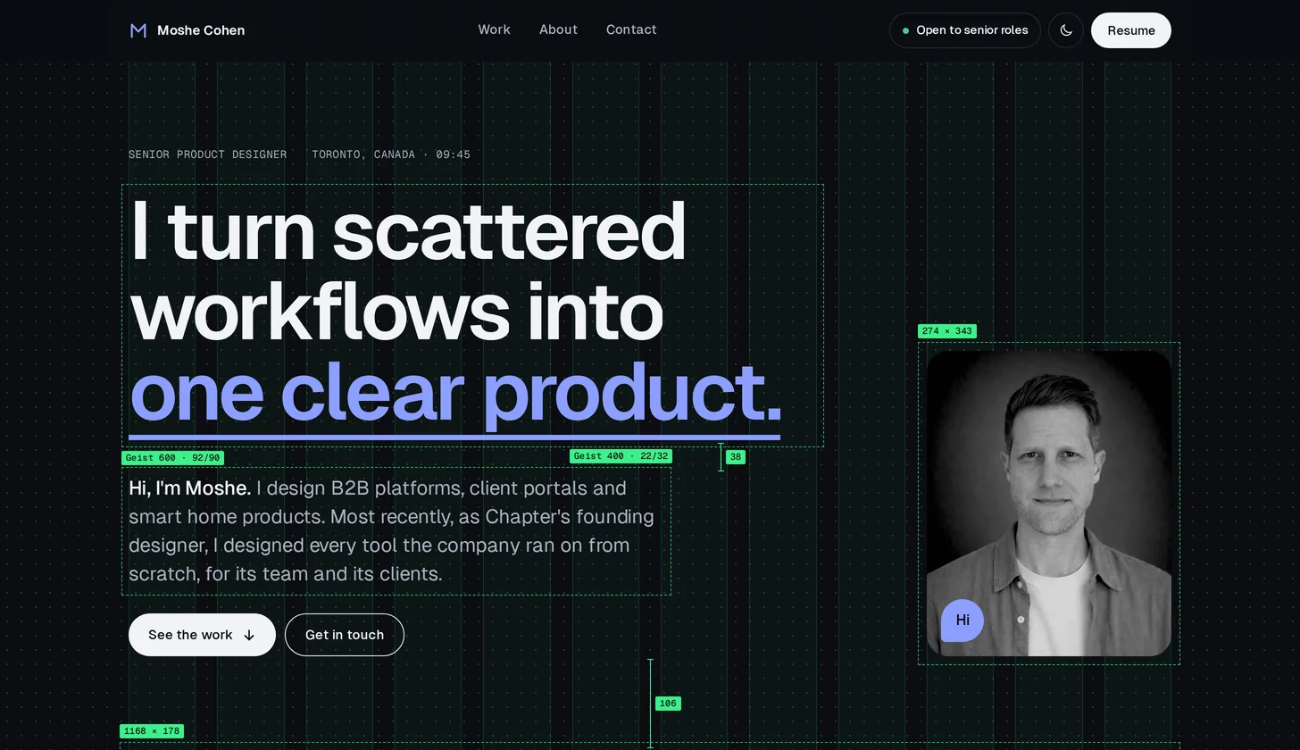
The site has light and dark modes. I wanted the switch to feel like liquid filling the screen, so two directions were tried on a copy of the home page. Ink won and now runs on every page.

Try it now with the sun or moon button at the top of this page.

Ink: the dark mode spreads from the toggle with a soft edge
Ink · chosen
Mist: the light mode drifts down from the top like fog
Mist
Home and About pages · Portrait

Elegant, or not at all.

Over my photo, a small lens shows an empty image placeholder, a quiet nod to the work behind the screen. It took three rounds.

Try it on the home page or the About page.

Why it went back

The light had a hard edge, and the crossed box looked like a debug view. It was unclear what the visitor was seeing.

First version: a flashlight with a crossed placeholder and an outlined silhouette
05Quality

A design QA pass before it went out.

Before sharing, I asked AI to audit the site like a design QA.

06Learnings

What I learned.

  1. 01

    Trying is cheap. Taste decides.

    A new version took minutes. My time went into deciding what to keep.

  2. 02

    Specific notes get better work.

    A note like "too busy" led to another round. "The Before looks better than the After" was fixed in one.

  3. 03

    The facts have to be mine.

    AI writes a clean sentence about anything. Only I know what happened, so every claim went through me.

Contact

Let's talk.

I'm looking for a senior product design role on a team that builds complex products. B2B platforms, operations tools and client experiences.